#gouache over graphite
Explore tagged Tumblr posts
Text

Russ Heath - Cowboy on Horse Painting Original Art (1947) Source
3 notes
·
View notes
Text

365 Days of Drawing: Year 10
Day 82- Nov 21st, 2024
© Ethan H Hutchinson
#mixed medium#pencil#graphite#pen & ink#ink#water color#gouache#marker#over the garden wall#Beatrice#melanie lynskey#blue bird#otgw
18 notes
·
View notes
Text

An art piece for Valentine's day <3
Multi-media -- graphite, prismacolors, himi gouache, acrylic, watercolor brush pens, micron fineliners, markers, and an assortment of papers :]
#artists on tumblr#my art <3#art#diy#original art#crafts#craft#traditional art#colored pencil#acrylic paint#gouache#graphite#sketchbook#drawings#mixed media#I barely finished this in time before valentine's is over lmao
5 notes
·
View notes
Text
OOOOOH
almost every eye. gouache oils graphite
#AMAZING#GORGEOUS#BEAUTIFUL#sorry im vibrating over this#they all look SO COOL#not my art#painting#gouache#watercolor#art#dark art#horror#oilpainting#oils#illustration#graphite#eyes
981 notes
·
View notes
Text

Marie-Desiree Bourgoin (French, 1839–1912) • Sarah Bernhardt Sculpting in Her Studio • 1879 • Watercolor and gouache over graphite • Metropolitan Museum of Art
#art#painting#fine art#art history#marie desiree bourgoin#french artist#sarah bernhardt#watercolor over graphite#paintings of art studios#19th century european art#paintings of interiors#women in paintings#the painted room art blog#art blogs on tumblr#dogs in artworks
473 notes
·
View notes
Text
eaudera's detailed tutorial for skin rendering
okay loves i've put together a tutorial in text form detailing my step by step process of shading darker skin + the brushes and techniques I use and why I use them. you will be following along as we shade a piece together, you can find the lineart to the piece here. *turn off your true tone and night shift displays for the most objective viewing.
i wrote a lot on the preview pictures, if you find spelling errors (which you def will) or are unable to read my handwriting, you'll find the typed out version of the writing in the alt text feature.
disclaimer: i'm not an art professor nor am i academically/classically trained in art. a lot of the verbiage and techniques i'm using to teach you all here are from my current self taught and observed understanding of art, light, and anatomy
support me: kofi / ig / twt / commissions
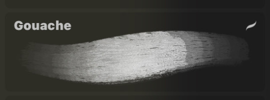
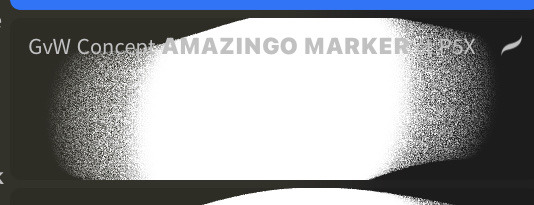
firstly, here are my two staple brushes. you can find the second brush here, i modified it by making it larger.
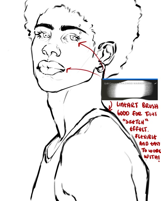
the lineart brush is very good for easy sketching and simultaneously cleaning up that sketch to produce the final lineart you'll be using in your piece. the diffusion from the erased parts/the diffusion created by lowering the pressure of your pen creates a light graphite effect which i enjoy! give it a shot.
you'll notice quickly that there are lighter strokes throughout this lineart, these are simply acting as rendering guides for me in order to remember certain placements. i erase/draw over these lines a lot.
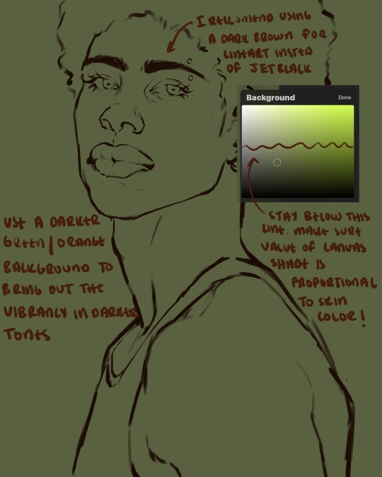
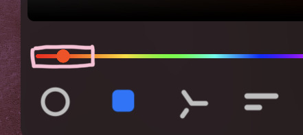
i initially learned to shade skin on a completely grey background with very slight orange undertones, and for a while this was very helpful in providing the most objective view of the base colors you're using (objective as in free of being effected by colors of different values). as you might know, using a white background for dark skin will seemingly darken the value and dim the vibrancy of your base colors, and using a black background will do the opposite. if you're using a darker skin tone, you want your canvas shade to be of a value that is proportional to your skin tone to avoid the same problems created by colors with too light or dark of a value. now if you're using a screened device to draw, you have the extra burden of screen reflections/wavering color output on different screens, so you're never really sure if the exact color you're using will be consistent across the board. priming your canvas with neutral colors will help with that. whereas priming with more vibrant colors will slightly change the undertone of your skintone (especially if you're using a low opacity brush), but it makes for a funner canvas and more creativity with your color palette imo. if you're a beginner i recommend you stay below the wavy line to avoid too light of a canvas shade.
for these same reasons i avoid keeping my lineart jet black. when you lay down the base colors under a black lineart it can look very unfavorable.
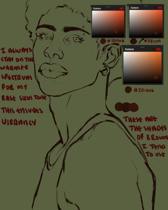
here are some skin tone variants that i tend to use the most, peep how i never wander off too far to the left of the spectrum where the reds are. i definitely favor red-oranges as compared to green-oranges for my skin tones, however, because i stay primarily on the left side of the color spectrum for my rendering, red can quickly become too much too fast. so i make sure to use a skin tone that can work very well with green-orange shadows. for this specific piece i will use the third shade (#2d1606).
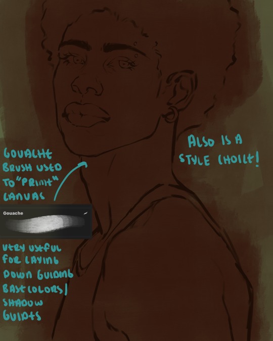
heres where the gouache brush comes in handy. i use it very loosely to "prime" the canvas almost. if you've ever done oil painting you'll realize very few artists draw directly onto a completely white canvas, though i've already primed my canvas essentially by changing the background color, i loosely shade over it with the skin tone color using the gouache brush. i find this gives me a better grasp on the composition of the piece due to increased harmony between the canvas and the skin color. it also looks really cool to me and resembles a real canvas almost.
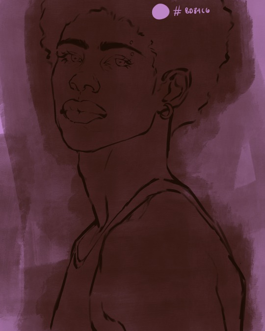
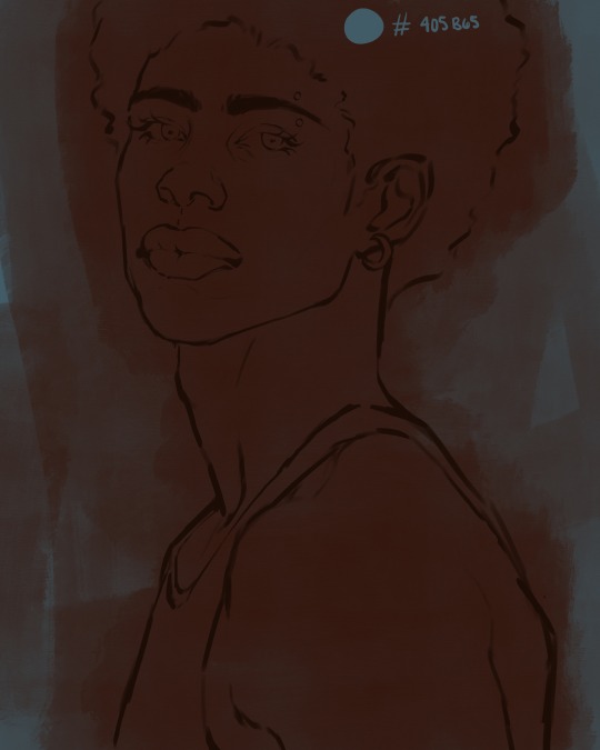
as stated before, priming your canvas with neutral colors (grey) can help give you a more consistent view of your base colors, when you get the hang of understanding the colors you most often use (i.e, how they interact with other colors), you can start using more vibrant and fun colors to color your canvas with! the gouache brush changes opacity depending on the pressure exerted by the pen, if you zoom in you'll notice patchy areas where the canvas color bleeds through the layer more prominently than it does in other areas. for some people this might throw off the consistency of the shadows, but you should be fine as long as you're using a consistently opaque brush (which we will be doing)
i know i recommended beginners use a grey canvas like i did, but since this tutorial is using my techniques i figured i'd also teach you guys how to use variantly opaque brushes to your advantage. we will be drawing on the pink canvas from here on out.
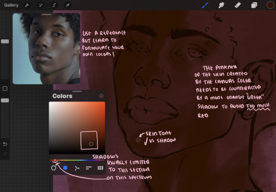
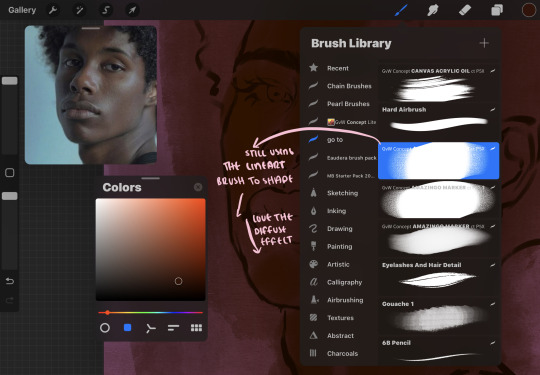
a reference is so helpful, i still rely on references to guide my shadows/lights. i'm past the point of relying on references for exact coordinates for rendering or lineart, but they are still incredibly helpful. in most references of darker skintones you come across, color dropping directly from the picture will give you very grey colors! we want to prioritize vibrancy in this case, so attempt to formulate your own colors or colordrop and increase the vibrancy :)! keep in mind i'm now using the lineart brush to shade. the diffuse/soft corners of this brush allows fewer pixels to be scattered wherever you lessen the pressure, this is perfect for color dropping medium colors to blend two colors together. you'll see how i blend colors later on.
as mentioned previously, red can become too much too fast- so i avoid monochrome rendering as much as possible by using shadows of different undertones. my most frequent combination is using a red-orange skin tone and then using a green-orange shadow.
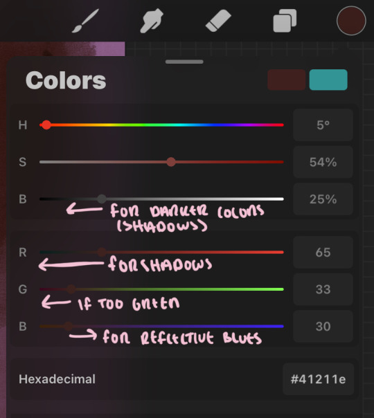
the value spectrum will be your best friend in mixing values and undertones, i use it all the time to formulate the best less saturated darker shadow that is proportional (not too dark, not too grey) to my skintone value. if the shadow is too green simply increase the magenta, if you're looking for a "reflective" shadow, increase the blue.
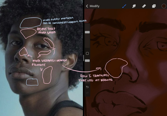
when i begin shading, i always slide the curser to a truer orange color on the spectrum and increase the saturation (slide towards the right) while i decrease the brightness (slide down). heres how it looks when i'm jumping between shadows and highlights while trying to keep my colors proportional (but not identical) to whats happening in the reference ^. i most often times will rely on the value tool, however.
you will notice that a lot of darker skin tones have patches of orange vibrancy, these areas are most common on the nose and cheeks. this is only a detail to pay attention to if you're going for more of a realism rendering style :)
now onto how i prefer to bridge/blend colors together by utilizing the blend tool.
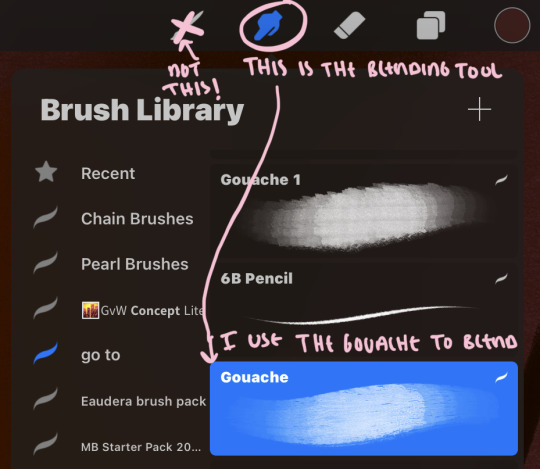
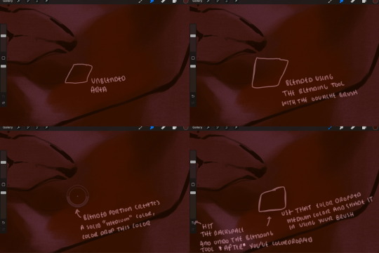
i do not like simply blurring colors in order to blend colors together, it can lead to overblending which can make your portrait look heavily gaussian blurred (think 2010 deviantart art... yea that). the brilliant thing about procreate is you can utilize brushes really efficiently, which include changing the brushes you use for blending. so in reality, artists who use the blending tool on its own can still have portraits that don't look it! there also exists plenty of brushes that have properties allowing it to blend into its surrounding colors are you draw. but in my case, the above photo is 99% of the times how i will bridge two colors together. doing this allows me to keep pretty consistent brushstrokes across the whole portrait, which i enjoy. it also gives me better control of the shapes i use in my rendering, an aspect that is pretty easy to lose when you're using the blending tool directly and solely.
in case the blending process is a bit hard too see, heres that same process recreated with different more visible colors:
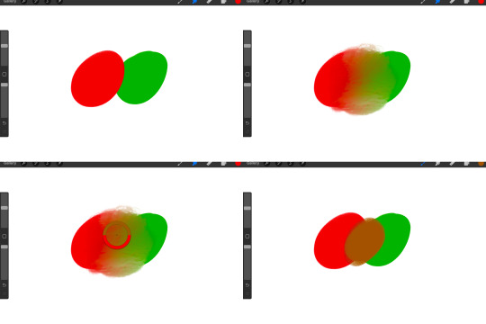
now once you've placed your shadows where they generally tend to be (according to the reference photo), let's make those shapes a bit more specific and pick up on smaller details to make your rendering look more complete.
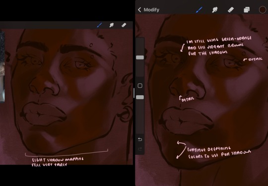
your base colors will never be as dark or as light as you need them to be when you begin rendering, making sure you have a decent contrast between your lightsource highlights and the shadows is key to capturing the essence of a light being cast on your character. it's much easier to keep building upon your shadows before rendering the highlights, i laid down the highlights only to create a guide/help me map my shadows better. do not darken the entirety of the areas affected by shadow, you'll find that shadows are rarely ever the same value, it's a gradual process affected by things like position, height, etc. so make sure the darkest of your shadow colors are preserved only in areas where the shadows are the or should be the darkest.
you'll notice i labeled some areas as "detail", adding very specific shadow placements is a detail. in the reference, the model has a pretty prominent brow bone, creating a shadow over where his eyelid creases just above his lash line, paying attention to feature details like this help enhance the rendering and its realism.
now that i've mapped my shadows i'm going to move onto to rendering my highlights and the region of the face where the lightsource is most prominent.
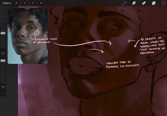
i described shadows as a gradual process earlier, this is because of the lightsource. light tends to spread when its further from the affected surface, creating a larger area affected by the light. of course, this varies depending on how intense and how close/far the light source is. in this case, the light is being casted above him further to the other side of his face, but again, remember that the face is not 2d and more prominent areas are affected more by light. it's due to this that there still exists a, albeit very minimal, shadow beneath his cheekbone. i exaggerate the shadow here for stylistic purposes, but it also helps in keeping me uphold that contrast between the highlight and shadow once again. so i refrain from blending the light into this area like i did in other areas.
midtones are the areas most unaffected by the light source, they're neither shadows nor highlights. and because light spreads, it is brighter in certain areas and darker in others. it is most easiest to blend the darker ends of the highights into the midtones of your portrait. you can emulate this by once again using your blend tool. blend the outer areas of the light and colordrop this color and use it as the darker light more proportional to the midtones. note that before i add even lighter shades to the areas where light is most concentrated, i blend what highlight placements i currently have there.
we're going to switch gears now and focus on the reflective shadow occurring on the darker half of his face.
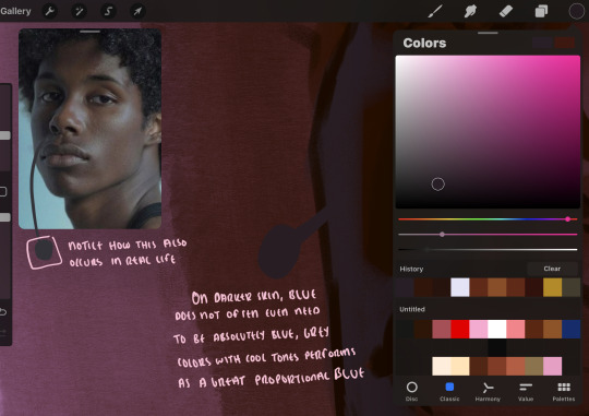
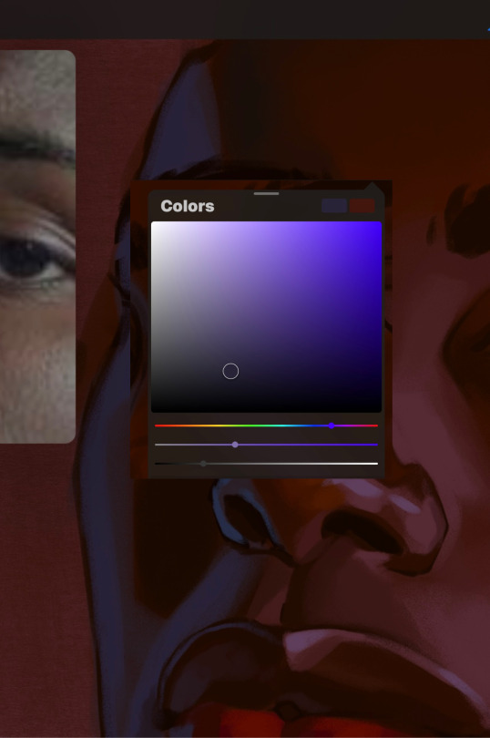
this shadow is a reflection from the lighter background the model is up against, the light being casted above him is allowing for some bounce back from his surroundings, leading to very faint light visible in areas primarily affected by shadows. hence why i'm referring to these colors as "reflective shadows".
in this case, the reflective shadows are blue, or appear to our eyes as blue. on darker skin, "true" blues (blue-purple) are not often times present. what is present rather, is a very grey tone with cool undertones/a grey tone on the blue side of the spectrum, which creates a blue that is much more proportional to the value of the skintone than a true blue. in this case i used a deeper grey on the pink color spectrum, which is more purple. this was intentional, and was done in order to create some sort of color harmony between the contrasted deep oranges im using for the bordering shadows and the blue-grey i'm attempting to emulate.
while i utilize this blue-grey, out've a purely stylistic choice, i still introduce true blues to my rendering. in fact i love using blue/purple reflective shadows in my art, it creates a stunning and colorful render. in this case, i used the blue-grey as a stepping stool to introduce that trueer blue more naturally. you'll see this happening in the second picture above, where i used a slightly more vibrant and slightly more brighter blue, and used it on areas where this reflection was more prominent (and therefore brighter).
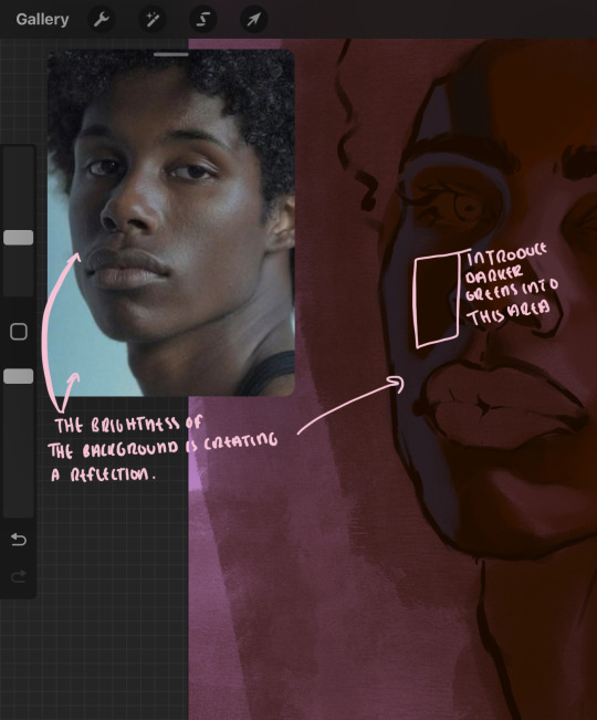
you'll notice how the shadows that border on these reflective colors are less saturated and darker than the shadows on his chin. introduce a darker and less saturated (more green) shadow to that area on his cheek and the darkest shadow of this photo, the sunken area near his nose bridge and inner eye corner. i emphasize this line in the lineart so you can follow this shadow more accurately:
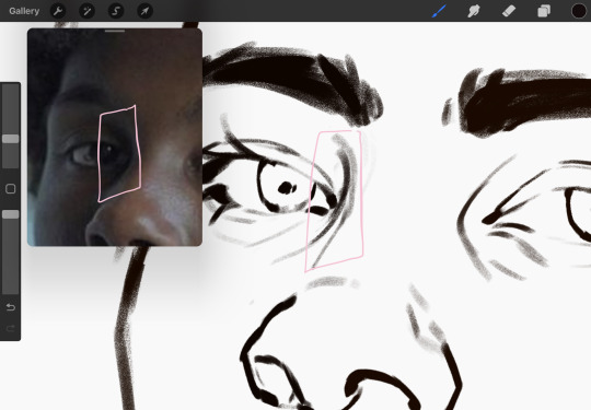
this is also a detail in my opinion and can make your portrait more realistic if you include.
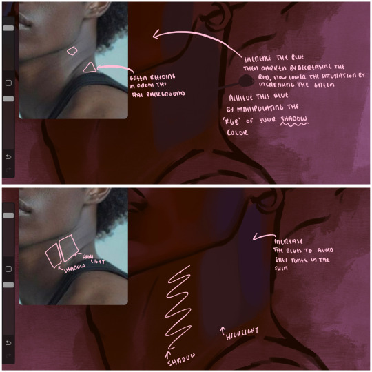
we're going to pivot to his neck area before continuing. you'll find the area of his neck with the most light is also the least vibrant, i laid down a grey base color to emphasize this detail in the portrait. afterwards i added key details. i wanted to stay at least somewhat true to the color dynamics occurring in the reference hence why i used the grey, but i'm not a very big fan of using blatant grey directly on the skin, so i made it more blue.
moving forward, the outer eye and the nose can be some of the most "detail focused" areas of the face when it comes to rendering. due to their more "bulbous" anatomy, light tends to curve around them in more complex ways than the flatter parameters of the face.
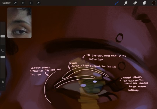
when it comes to the many creases that surround the eye, the skin folding over itself creates a very thin shadow from between the folds. the key to rendering this crease is to concentrate the blending to a very small scale, do not overblend the area because the hill created by the crease very easily captures light, creating an area where the shadow and highlight meet in very close proximity. slight blending is needed for this area, you can deepen the shadows in both horizontal corners of the eye for more accuracy. the midsection of the total eye area (eyeball and socket) tends to capture the most light, remember this is due to how bulbous rounder shapes tend to capture light from whichever direction its coming from.
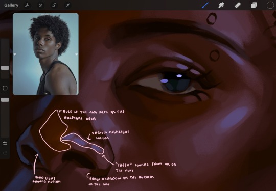
this is of course the case for the nose as well. highlights are typically placed as a dot on the outermost part of the nose by artists, but highlights also spread on either side of the tip of the nose. the nose tends to collect a lot of oil, creating a sort of sheen on the upper parts of the nostril. when rendering a portrait where the position of the head is more cast to the side, the highlight of the nose changes from the bulb of the nose, to the upper nostril. in this case, the highlight spreads, causing a "half tone", or the remnants of the light on the bulb of the nose. this is the easiest place to blend highlights and shadows together. now for the shadow detailing on the nose, i'm actually drawing on top of the lineart on a separate layer. which i'll go into detail about in the next part. you want to focus the shadow on where your lineart is, the outermost part of the nose.
now were going to really detail your portrait by introducing a new layer, the detail layer! this isn't technically apart of the skin rendering, so i'm gonna keep it very brief. this is the layer you're going to render the lips, eyeballs, and eyebrows. more specifically, the purpose of this layer is to reduce the reliance on lineart. in terms of order, it goes above the lineart layer. we're going to soften and even erase the lineart in certain aspects. i use bolder/thicker lines when creating my lineart, but this can become a nuisance/hinderance when rendering.
starting out with the lips:
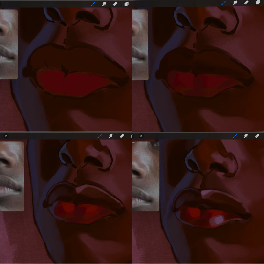
people w brown skin tend to have two toned lips, with the top lip resembling the same skin tone as the face and the bottom lip being redder/pinker and lighter than the upper lip. in my case, i prefer a more vibrant red for the bottom lip. once i lay down these base colors, i begin shading on the second layer.
i personally enjoy the look of a poutier lip shape, this includes emphasizing the middles of the lips as opposed to the ends. i've highlighted the shapes that this lip shape often entails. the small circles on the corner of the lip line are just pockets that occur when the mouth is closed and become emphasized by the fat around the mouth. the parameters of the lip lines do not often meet these round corners, theres often times a "double lip line", that exists around these areas. i love including that in the art, its very easy to emphasize by simply drawing a highlight from the corner of the lips along the curvature of the bottom lip towards the middle.
shadow mapping on the lips tend to go: highlight, shadow, highlight, shadow. the top lip going inward creates a highlight on the most outward part: the top of the lip. and the bottom lip curving outward thus creates a shadow on the bottom of the lip.
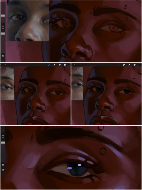
when it comes to the eyeball, i don't draw the white parts as solid white, nor do i make them too bright most of the time. they're most often times an orange grey, i also dont spread this color out if you can notice the uncolored white part of the eye. i do this intentionally to keep some of the shadows that are naturally present on the eye. very specifically right where the upper eyelid sits on the eyeball, it tends to create a small shadow that follows the curvature of the eye. this shadow is crucial, if you can see the first and second picture do not have this shadow, making the iris look more exposed and the eye appears to be held wider.
when it comes to the iris, i do very little. if i'm drawing a dark colored eye i will cover the entire iris brown, before darkening it with an almost black color. i leave the brown sides of the iris exposed to aid in bridging the values between the whiter parts of the eye and the very dark iris. this blended ring also appears on all eyes in real life. lastly, dark eyes tend to show light reflections much easier than lighter eyes. these reflections can be any color in art, in this case i kept it blue-green. i bend these reflections around where the pupil would most likely be depending on the drawing.
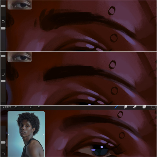
next, the eyebrow. i find it tedious to draw individual eyebrow strands when it comes to rendering, i actually prefer to blend the parameters of the eyebrows to create cohesiveness. sparse and fine eyebrow hairs are penetrated by light and shadows more than what you'd find on the scalp. it's harder to see light on someones scalp due to the bulk of hair crowding the scalp, whereas as its easier to see such light on the eyebrow. to introduce this concept to my art, i will initially draw the entire shape of the brow. then when rendering, i erase the parameters, leaving the darkest part of the brow. then i blend. the lower brow bone will be blended the least, whereas the area of the eyebrow connected to the T zone will be the most blended thanks to the shadow following the nose bridge. the far end of the brow by the hairline tends to be the lightest given the light source.
and lastly, i loosely draw a white border around the portrait for stylistic purposes. then i combine the layers (group together your layers, then duplicate and compress the duplicate group so that you still retain your individual layers) to edit. i typically add noise and play with the curve setting. and heres the finished image:
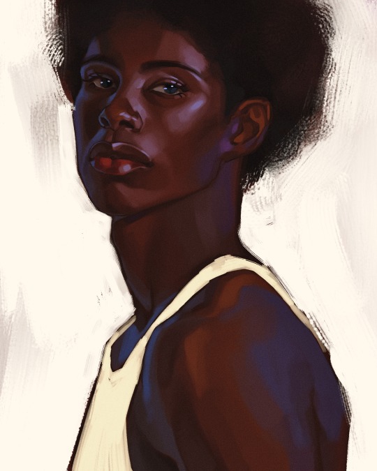
i hope you enjoyed!!
#i didnt proofread this if u find spelling errors pls lmk#black artists on tumblr#digital art#illustration#painting#black art#commissions#tutorial#art tutorial#how to shade#rendering tutorial#brushes
284 notes
·
View notes
Text

Meet the Artist: @juliettelime
Hello! My name is Kiara Juliette Lime (she/her) and I am a Filipino-American illustrator based in Spokane, Washington. My work is driven by emotional characters and narratives and I am most interested in contemporary, slice-of-life, and romance genres. I started drawing around five years old and graduated from art school with a BFA in Illustration in May of 2022. My favorite mediums to work in are digital (Photoshop + Procreate), ink, marker, acrylic and gouache paint, and occasionally graphite, and my biggest artistic influences are shoujo manga, Taylor Swift's discography, and fashion illustration. Nice to meet you all!
Pleased to meet you, Kiara! Below are some of her artworks for you all to appreciate.


Check out more of Kiara's work over at her Tumblr, @juliettelime!
-
We are highlighting some of Tumblr’s talented artists of Asian descent all month as part of Asian American and Pacific Islander Heritage Month!
#meet the artist#meet the artist on tumblr#artists on tumblr#art#juliettelime#asian artists#aapi month#apahm
2K notes
·
View notes
Note
🎲 muehehehe get diced >:3 🪐
Anatomy. Welt Yang.
Prompt: 13. Kiss to the chest
Word Count: 1,500+
Thank you for the ask, Stardust <3 Now we just gotta fan over Welt together


The mattress hit your knees as you stepped backward, the cushions something you barely had the chance to register the comfort of before you were tripping over your own two feet and falling backward. The form on top of you doing little to help. Rather, it was only making it worse as Welt fell on top of you with an over exaggerated oof! Hair askew and glasses nearly falling off his nose from the game of tag you two were playing only minutes before around his room.
Having ducked around the desk, the trashcan full of crumpled up paper, a giant stuffy March gifted him as a thank you for helping her on their last shared Trailblaze mission, and lastly workout equipment.
All over one pencil.
His favorite, or so, Welt claimed. Apparently, it had the perfect grip, so it sat comfortably in his hand. To draw, it proved the best one was familiar with the materials they used. Like how every painter has a favorite medium as either watercolor, gouache, ect, seeped into the bristles of their brush.
Graphite covered the side of his hand, staining it a metallic gray you had grown accustomed to seeing in him when he slipped the gloves off and sat before the sketchbook he kept. One that was nearly falling apart now, bindings getting looser with every time he pried it open to add another drawing to the collection. If not that, to slip pages of your own horrendous attempts at doodling him away for safekeeping.
Despite your protests to simply crumple the paper up and toss it away as the garbage you saw it as, Welt insisted otherwise. Said it was something precious to keep, memories embedded in the scribbles that could barely resemble a human face. Nothing like his art. Not from what you've seen, at least.
You had seen him make circles and lines into something more than what you could see them as. A circle turned into a head, a box into a ribcage, a line, and another line paired together to make tweezers. It was only when that item was added did it click in your mind he was drawing the picture he took of you earlier that day plucking your eyebrows. For some reason.
“I believe this means you owe me my own materials back.”
“Now why would I do that?” You asked, trying to hold out your arm even further so Welt couldn't slip it out of your hold. To pluck it from your hand like one would a loose string on a shirt. Or, as is the case with the two of you, his scarf. Though, it's not like your effort could do much against the man who could, quite literally, make the item float out of your hand and back into his own.
Surely that had to be classified as cheating.
“Are you going back on your word from before, honey? I distinctly recall you saying you could wait for me to finish what I was working on.”
Yet here you are, still trying to play keep away.
“Yeah, but then I got bored.”
A sigh. One that brushed against your skin from how close he was. Like this, you could even make out the sparkle in his eyes. Or it could just be a speck of lint on his lenses. One of the two. “I suppose that's fair.”
“Exactly. So….” You trailed off. Honestly, you weren't expecting to get this far, so it wasn't a surprise you found your own words to be suddenly falling flat. “Well, if you are so intent on focusing on art, why don't you teach me something?”
There, interactive. An olive branch offered to his outstretched hand, grasping something you can do together.
“Teach you?” Welt repeated, mulling over the words as they rolled over his tongue. “I can work with that.”
The pencil was pulled from your hand before you could even whine in protest as he pulled away. Leaving you to place it on his sketchbook only to return shortly after. Mattress creaking once again as hands, now free to do as they pleased, slid along your cheek. Thumb right under your eye.
“You're a hands-on student, aren't you? If I remember correctly…”
“I am.”
Welt muttered an “excellent” as his thumb brushed through your lashes. Your eye squeezed shut on instinct, but this didn't seem to deter him at all. “Then we can start with our first lesson now.”
“That being, professor?” You didn't miss his eyebrows burrowing ever so slightly at the nickname, but still you smiled up at him like nothing was wrong.
“Basic shapes. We can start through profiles as an example.” His touch moved to the eyebags you had been sporting that morning, running along the colored hue of the skin that gave away your bad sleeping habits. Again. “The head is not perfectly rounded, but the shape that resembles the dome of the skull the best is still a circle. Eyes are round under the lid, also best drawn using a circle first.”
“I'm getting some real creepy imagery here, teach.”
“I can understand that. It might have been easier to pull up images instead to give you something to see. To lead by example.”
“But?” You asked, head tilting ever so slightly as you watched Welt silently mouth words.
“But first, let me ask you something. When I ask you to pick something round, specifically on the human body, what do you think of first?”
Well, your first thought was balls, but you were going to keep that one under a tight lid. Maybe even in a trash can. Though that does risk the chance of Stelle rummaging through and finding your secrets.
Second? Well, that was easy.
“The callous on your finger.”
Accrued from hours, days, years even of leaning over pen and paper and letting the images in his mind come to life. Something that's not perfectly round, but it always caught your attention nonetheless. Your own fingers ran over the bump anytime you hold hands.
“I think of a ring.” Before you could question him on that, Welt slid his thumb over your lips. It was second nature to press a kiss to it, just like it was second nature for him to smile at the gesture. “Or that earring you always lose and I have to find for you.”
“No need to call me out like that.”
“Ah, I apologize.” The look in Welt's eyes was enough to tell you that even if he was sorry, he still knew he had a point.
“Yeah, yeah, what else? I can't learn to draw from circles alone, professor.”
“This 'professor’ is beginning to think the student is in a rush. Now that's no good way to get A’s in my,” He took a moment to look around the room again, taking in the place you two shared and made your own on the express, “class.”
“Oh, I'm terribly sorry.”
“Your tone tells me otherwise.”
You bit your lip, trying to stop the smirk that was hoping to overcome you.
“As for more lessons, there are topics we can focus on.”
As he spoke, Welt's hand slid down your neck, tracing the hollow where the skin met your collarbone. Your shirt shifted ever so slightly out of the way, brushing against your skin the same way he was as his lips fell to meet yours.
“Anatomy, for example.”
“Now that's a big step from shapes.”
A giant leap, actually. You couldn't even draw a perfect circle, but here he is suggesting something that you've seen even him struggle with. Reference photos had been pulled up countless times as he drew. It was that, or, you'd find Welt standing before the mirror to see how his body shifts in this new pose. He's even asked you to indulge him once or twice and move along with how he places you, pen in his mouth as he chews on it to help him think. Or so he claims.
“No need to worry, we can start small. Besides, did you not just say you can't learn to draw from circles alone?”
Ahh, your own words. What a great way to turn them around and shove them back in your mouth. Something to choke on for fun.
“And what is this something small, professor?”
Fingers toyed with your shirt, unbuttoning it as Welt looked up at you, making sure this was okay. Just like he always did. With your nod, he continued, undoing the top three until the tank top you were underneath was peaking out.
“It's simple. Simple enough that I can show you.” Welt said. His lips met your chest, heart thrumming under him, beating wildly in an attempt to escape and give him what has already been his since the moment you first saw his smile at a stupid dad joke. Of all things.
“But something tells me this will be easier to do without these clothes in the way. Do you mind, honey?”
And of course you didn't mind at all.
#hoyoverse#x reader#welt yang#welt x reader#welt yang x reader#gn reader#hsr#honkai star rail x reader#honkai sr x you#honkai sr#honkai star rail#/glassanswers#/glasswrites#divider by saradika graphics
163 notes
·
View notes
Text

Johann Stephan Decker (German), Album offered in 1826 to Princess Marie d'Orlèans, daughter of King Louis-Philippe: Plate 7 - View of the drawing room of the Hofburg, Vienna, 1826, gouache and ink over graphite.
#johann stephan decker#hofburg#vienna#german art#german artist#album#drawing#watercolor#gouache#painting#art history#artwork#19th century art#19th century interior#19th century#green#sitting room#zimmerbild#palace#palace interior#1820s#interior design#decor#decorative arts#period design#period interior#women in art#period fashion#austria#austrian interior
37 notes
·
View notes
Text

Saint Cecilia, Gustave Moreau, circa 1890-95
Gouache and watercolor over graphite on wove paper mounted to wood panel 13 5/16 x 6 3/8 in. (33.8 x 16.2 cm) The Metropolitan Museum of Art, New York City, NY, USA
#art#painting#gustave moreau#modern art#symbolist art#symbolism#19th century art#1890s#19th century#gouache#watercolor#works on paper#the met#french#religious art#100 notes
115 notes
·
View notes
Text
Love at First Paint: A Beginner's Guide to Painting

"Almond Blossom" by Vincent van Gogh (1853 - 1890), Saint-Rémy-de-Provence, February 1890
Have you ever dreamed of being like Picasso or Vincent Van Gogh? If you do, you are looking at the wrong blog because I am far from them. But hey there! I'm Eden Amor, a freshman student and a self-taught artist who just loves to paint.
Art has been my passion since I was a kid, and as I grew older, I fell even more in love with it and started trying out different mediums and styles. But there's just something about painting that really excites me! I started with graphite, then moved on to colored pencils, and even dabbled in charcoal (although I never got around to using those charcoal pencils I ordered online). Finally, I found my true love in watercolors, and I've been obsessed with working with wet mediums ever since!
If you are a beginner in painting (like me, have been a skill of a beginner for years), you can enjoy my blog and get some tips that I learned from my starting journey. But if you are just interested in painting or in art generally, you can still read this blog.
Just a disclaimer: I am no expert and just a self-taught artist. Some things might work for me and not for you, and vice versa, so take this blog with a grain of salt.
LEARN ABOUT PAINTING
Since I am a self-taught artist myself, I never applied for workshops in drawing or painting. But most of my art knowledge is from YouTube tutorials, shorts, and IG reels (I have no TikTok, I don’t know why). I suggest learning about the basics before painting whatever you want because you’ll get disappointed after the result or wondering why everything is not working the way you wanted.
But before anything else, find the medium that you want. Mediums like acrylic, oil, gouache, and watercolor. There might be more but these four are some of the common wet mediums. One thing to address about these mediums is that they all have different properties and the techniques you’ll approach, the materials you’ll use, and the finish or outcome of the painting will depend on the medium.
MEDIUMS
Watercolor
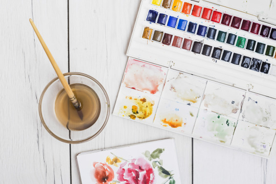
My recommendation for anyone wanting to start painting with no experience is to use watercolors. The only things you need are watercolor paint and water. Unlike acrylic paint, which, although water-based, can get pretty messy and dries quickly, giving you little time to blend and touch up unless you use an acrylic medium called Retarder, which is a medium that you mix with the paint to slow its drying time, but will cost you more. So, as simple as watercolor can be, it's a great starting point for a beginner in painting.
However, watercolor painting can be tricky when it comes to water manipulation. The amount of water your brush holds affects in creating an even layer of paint. The drying time takes hours, especially if you are working in layers, if you paint the still-damp surface too early, you will ruin everything and you cannot cover it up since watercolor is transparent. That is why watercolor painting is done light-to-dark because dark colors cannot be covered by light colors. So planning ahead of time is suggested and should not paint with watercolor impulsively.
Acrylic
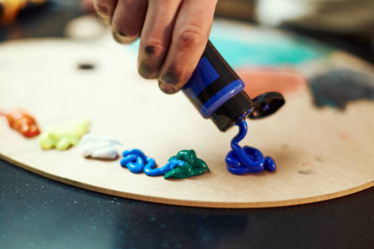
If you want to take the next level or just explore other mediums, acrylic painting is great for high coverage and textures. What watercolor doesn’t have but acrylic has is the ability to cover mistakes. In acrylic painting, you can paint on top of a painting, which is great especially if you change your mind or decide to start all over again, as long you coat more than one layer of white paint then you have a blank canvas again.
However acrylic paint, as said earlier, dries quickly which can be a disadvantage if you are a slow painter (like me) and especially if you are making a seamless gradient, which is very difficult to achieve and not as easy as you think. Since acrylic is water-based, cleaning is very easy with just water as long as the paint is still wet. Hardened paints can be peeled off easily but only on smooth surfaces, but if you got it on something like fabric, it will be forever on it.
Gouache

I describe gouache (pronounced as ‘goo-aash’) as a combination of watercolor and acrylic. Because like watercolor, gouache is water-activated paint, which means that dried paints can be revived and used the paint again when wet. And just like acrylic, gouache has high coverage and a thick consistency which is great for texture. But unlike acrylic, which has a glossy finish, the gouache creates a matte finish once the paint is dry and it also dries fast giving you no more time for creating flawless gradients.
I use gouache for mini projects, or creating art trends I saw online, but I don’t recommend it for painting a big major project since it can be smudge once wet, and as of now, I don’t know if there’s an appropriate varnish for gouache so if you have any idea please let me know in the comment section.
Oil
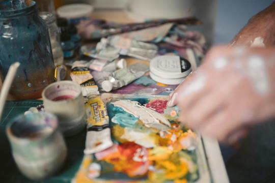
The most expensive of the four mentioned paint mediums is oil paint. However, oil paint creates the most realistic paintings. Despite its high cost, what makes me love oil paint is how smoothly the paintbrush glides, like butter. Blending oil paint is very easy, and you can create flawless gradients between colors. Oil paint has a very slow drying time. For small projects, such as those the size of half a sheet of bond paper, it can take days to weeks to fully dry and be ready for varnish. This slow drying time can be both an advantage and a disadvantage, depending on the complexity of your painting. It allows you to fix mistakes or make adjustments even the next day. Additionally, a small amount of oil paint goes a long way.
Oil painting can be hazardous because it involves flammable oil-based paints, as well as mediums like thinner and linseed oil. While water is used to dilute watercolor, gouache, and acrylic paints, oil paint requires the use of thinner. It's important to avoid washing oil paintbrushes with water, as it can damage the brushes and won't effectively remove the paint. Additionally, it's crucial to store oil paints, thinner, and linseed oil away from sources of heat and fire.
Since I am only new to oil painting, I cannot give much in-depth information about it and if you do please I beg for some advice and tips in oil painting.
Materials in Painting
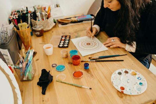
Painting can be an expensive hobby given that the materials used (especially the branded ones) are not really as cheap as a pencil and a piece of paper. But aside from being a painter, I am also a cheapskate.
I will never buy an art supply that is as expensive as my kidney, UNLESS if it is worth it or I can make money out of it. I don’t really have all the money to buy all the art supplies I want, I am still dependent on my parents and have no job yet (currently at college, 18, and an irresponsible young adult).
That is why I chose to buy art supplies online instead from the art stores near my place. And I think as a beginner, expensive materials are unnecessary because for me an artist should be able to make a masterpiece with his/her skill and not the tools. But that doesn’t mean the quality of materials will not make a difference. So if you are the same as me, you can use my tips.
Paint
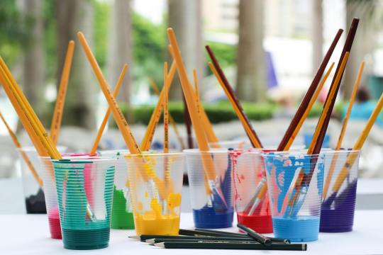
The paints I use are not of great quality, but they are good enough. I honestly thought that some of the paints I bought were much better than the pricier ones.
In watercolor, there are two common types: in the tubes and in the pans. The tubed paints have a consistency of acrylic, unlike the ones in the pans, which are hardened. What I have is the Superior Watercolor in pans set. I bought them online for less than $10, and it is a set of 18 colors with a brush pen and sponge included. The quality is great, it is not chalky, and it doesn’t smudge once dried. I spent my money wisely, and I do not regret buying it even though $10 is already a lot to me.
When it comes to acrylic and oil paint, I suggest buying the primary colors (ultramarine blue, crimson red, cadmium yellow), titanium white, black, and magenta only. I highly suggest buying a large amount of white because you’ll need it most of the time. Buying a set is very costly, but with these 6 colors, you can create any color, save money, and at the same time improve color-matching skills, which is an essential skill as a painter. If you wonder why I added magenta, it is because the combination of red and white is not bright enough to be pink or it is just different from the color magenta, and I think having magenta in the collection is a good addition. I used the Mont Marte brand in acrylic and Marie’s for oil paint.
Paintbrush
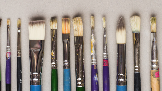
There are different shapes of brushes: flat, round, filbert, and detail are the commonly used shapes, and it depends on the medium you are using. For watercolor, a round brush is recommended, and a flat brush is recommended for thick paints like acrylic and oil paint. A filbert brush is also a flat brush, but the trim is round, and it is good for painting clouds. A detailed brush is used for small details like painting dots and thin lines or for small paintings. There are more shapes of brushes out there, but having a variety of brushes can be overwhelming. Get only the brushes you need and have them in sizes small, medium, and large. The size of the brush will depend on how small or big your painting is. Using the appropriate shape and size of the brush will lessen your expenses and you’ll learn to depend more on your skills than the tools.
There are cheap but not too cheap brushes available online. They are not branded, but the quality is good enough (like the ones I use), and the bristles don’t come off easily.
Paper
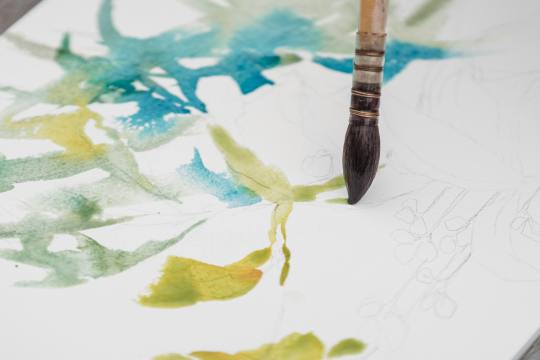
We can paint on anything, but nothing beats paper. However, the paper used in painting is not just an ordinary paper. The thickness of the paper used in painting, particularly watercolor paper, is important so that the paint would not easily destroy it.
Watercolor paper is usually combined with cotton, making it more durable than regular paper or cardstock. The percentage of cotton in the paper varies as the price varies. It is recommended to use 200 gsm paper, which is what I have because it is affordable and good enough to hold a few layers of paint.
However, I highly recommend using 300 gsm paper because the 200 gsm papers I use still curl up or bend and get wavy, which is a hassle when painting. The higher quality, 300gsm paper or paper containing 100% cotton is easier to work with, as I have observed online, even without taping the paper down, it doesn’t curl up. But of course, high-quality paper costs more, so 200 gsm paper is good enough.
If you are wondering why I called the paper used in painting "watercolor paper," it's because you can also use watercolor paper for acrylic, gouache, and oil painting.
There are two types of watercolor paper:
Cold Press - Cold-pressed watercolor paper has a rough texture, which is great for watercolor painting because it gives more depth to the flat painting (water is water, they can't have shapes and textures like acrylic).
Hot Press - The hot-pressed one is recommended for thick paints because it has a fine, smooth surface, which is great for blending smoothly.
Aside from paper, you can also use canvas paper, stretched canvas, or a canvas panel for thick paints. However, since you are only starting in painting, paper is recommended for practice and is much cheaper than the canvas mentioned above.
OTHERS
Masking Tape
Why masking tape? It is used for tapping down the edges of the watercolor paper so it stays put and flat on the surface which makes painting much easier, and also it creates a clean border. You may see other artists use washi tape because they are less sticky and won't damage the paper once it is peeled off, but I think using washi tape costs more, instead, stick first the ordinary masking tape onto your clothes until it becomes less sticky, and then you are good to go.
Mixing Palette
Usually in watercolor paint sets, the lid of the container serves as the palette. However, when using thick paints like acrylic or oil, a better alternative to a traditional paint palette is a picture frame. Mixing paint on a glass surface is convenient for two reasons: (a) it is smooth and does not absorb the paint, and (b) it is easy to clean. Dried acrylic or oil paint can be easily peeled off the glass or scraped with a blade or glass scraper, leaving a fresh and clean surface for mixing. Additionally, the wood or plastic frame around the glass provides protection against breakage and sharp edges.
Towel/Tissue
A used towel or tissue is not only used for cleaning; it is also mainly used for soaking up the excess water on a brush or for wiping off the excess paint. It is very handy, so you should always have it by your side while painting.
Jar
A brush washer is a must-have for painting. This is where you wash off the paint with water from the brush. You can use an old cup or jar as a brush washer instead of buying the fancy ones which is unnecessary. I prefer using a jar because it is heavier than a regular plastic cup, which prevents it from tumbling or spilling.
Here's a tip I learned from YouTube: use two brush washers. When you wash your brush once in a single container, the water gets muddy. This can make your fresh paint muddy when you switch colors. To prevent this, wash your brush twice: once in the first container and then again in the second container. This ensures that the water picked up by your brush is clean and not muddy.
ART STYLE
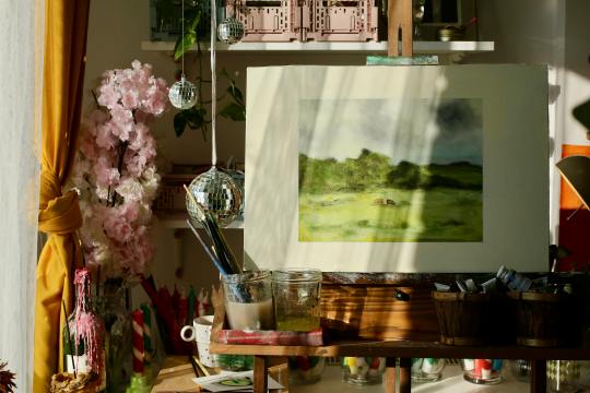
Early in my painting journey, I started practicing by painting scenic landscapes because they seemed easy to me. Of course, I overestimated myself. So I continued practicing more. Painting nature has grown on me, and I realized that my genre is landscape painting. The good thing about it is there is less structure unlike a portrait of a person, and shapes are organic so I will have no problem with imperfections.
However, I still don’t have the ability to create my own work. I still have to watch tutorials online to have a guide. Most of my artworks were tutored by the artists I follow. Once I start painting with just a reference from Pinterest, I tend to get lost and suddenly don’t know what to do. I end up not continuing the work, which is a waste of time, energy, and material.
Lately, I returned to working with watercolor, but instead of nature, I used a reference photo of a person as a subject. Sketching the face first is my least favorite part, because if I mess up sketching the face, the whole painting is also a mess. Most of my subjects are K-pop idols, especially BTS, because I am also an ARMY! Working with faces is difficult but once you succeed, it is all worth it.
Social media has highly influenced my art style. The fact that I get envious whenever I see new art trends gives me a push and inspires me to continue doing my art and explore more.
Check Out These Artists I Follow
Correa Art
Youtube: https://www.youtube.com/@CorreaArt
Instagram: instagram.com/correaart_
Jess Chung
Youtube: https://www.youtube.com/@JessChungArt
Instagram: instagram.com/jesschungart
Emily Mackey Art
Youtube: https://www.youtube.com/@EmilyMackeyArt
Instagram: instagram.com/emilymackeyar
Genelyn Sandaga
Youtube: https://www.youtube.com/@GenelynSandaga
Instagram: instagram.com/genelyn_sandaga
Socials
If you want to know more about my art, you can visit and support my two Instagram accounts:
@ChiliCheeseLover
@paintwith_amore
💜💜💜
If you have feedback to share, please do! I am eager to hear your thoughts. If not, kindly give this blog a heart; it is greatly appreciated!
💜💜💜
49 notes
·
View notes
Text

Maxfield Parrish (1870–1966) “Alarums and Excursions” Kenneth Grahame’s The Golden Age (1899) Source
#maxfield parrish#Alarums and Excursions#the golden age#kenneth grahame#Brush and black and gray wash with white gouache over graphite framing lines in pen and black ink#Once again were damsels rescued dragons disemboweled and giants…etc
11 notes
·
View notes
Text

A Lady Reading, Called Mrs. William Hunt
Artist: William Henry Hunt (English, 1790–1864)
Date: c. 1835
Medium: Watercolor and gouache over graphite on moderately thick, slightly textured, cream wove paper
Collection: Yale Center for British Art, New Haven, CT, United States
#lady#painting#reading#book#watercolor#gouache#genre subject#woman#interior scene#fine art#drapes#furniture#home#leisure#portrait#rug#settee#textures#window#wife#william henry hunt#english painter#english culture#graphite#english art#18th century painting#artwork#watercolor painting#european art#yale center for british art
33 notes
·
View notes
Text

Auguste Charles Pugin (British 1768/69-1832), The Saloon, Brighton Pavilion, c. 1826, watercolor and gouache over graphite.
#auguste charles pugin#watercolor#19th century#19th century art#interior#paintings#interior design#period design#nineteenth century interior#art#artwork#painting#british art#english art#british design#design#the metropolitan museum of art
44 notes
·
View notes
Text

find be on bsky if you're there, I post a lot more consistently over there
#my art#artists on tumblr#bluesky#painting#gouache#watercolor#art#dark art#horror#oilpainting#oils#illustration#graphite
126 notes
·
View notes
Text
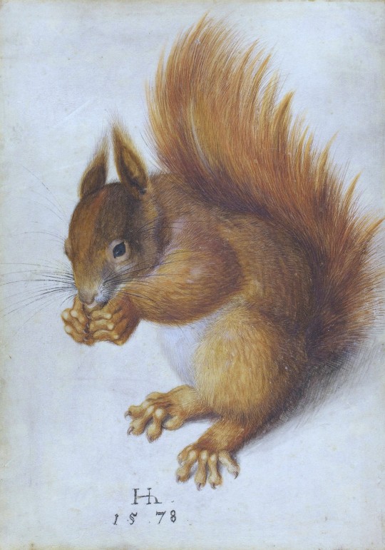

Hans Hoffmann (German, 1530 - 1591):
Red Squirrel, 1578, watercolor and gouache over traces of graphite on vellum.
A Hedgehog (Erinaceus roumanicus), before 1584, watercolor and gouache.
#hans hoffmann#16th century#watercolor and gouache#watercolor#gouache#red squirrel#hedgehogs#wildlife#digitally enhanced
294 notes
·
View notes